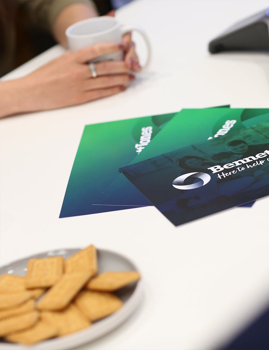

Bennett Jones approached sevenseven to review and consolidate their existing brand. The brand had a great pedigree and was trustworthy however had become outdated and tired. The challenge was to create a brand, tone of voice, rules of representation and visual rules that can be rolled out internally and externally to give consistent tone of voice in the written and visual sense whilst maintaining the brands recognisable colour palette and trusted status.


Sevenseven undertook a series of workshops across all Bennett Jones teams, senior managers and stakeholders to understand where the brand touch points, requirements and areas to avoid.
The brief was to maintain similarities with the existing brand from a visual recognition perspective. From discussions and workshops with various teams the three pillars that came through consistently where.
Listen > Solve > Support
We developed a dynamic icon to sit alongside he existing font for Bennett Jones and tweaked the strap line and typeface to be more customer friendly, the strapline was revised from 'Here to help...' to 'Here to help you...' as the emphasis was to talk directly to the individual from the brand itself.
The brand colours where also slightly lifted to a more vibrant version of the existing brand colours allowing all communications and materials to have a strong, clean and vibrant feel.
As part of the brand development we directed photoshoot to developing an image style that works both internally and externally for communications across Bennett Jones.


A dynamic, flexible 76 page brand guideline which sets the stall out for both internal and external communications across Bennett Jones. The document was supplied with a toolkit of assets for Bennet Jones to utilise across web and print.
Anthony Hayes, Director