We were approached by Mikhail Hotel & Leisure Group (MHALG) whose vision it was to produce this amazing venue. MHALG, owned by Andrew Mikhail and Rob Ashcroft, are extremely passionate about every project they undertake and this shows through in the scale of the venue plans. The challenge with this project was to develop a brand for a retro gaming arcade in the heart of Liverpool that was easily identifiable in the retro gaming arena but also unique, stand-alone and contemporary.
At first visit to the proposed ArCains site we were greeted with a tour of a shell of a building in the old Cains Brewery complex in Liverpool. The ArCains team already had a clear vision of what this space was going to be transformed into. After our initial walk round and discussions with the ArCains team we soon understood the essentials to the project and set about responding to the brief. Turning this wonderful building shell into a destination and brand that will be recognisable, not only throughout Merseyside but nationally, was a key focus and vision for Andrew Mikhail and his team.
It’s not every day you get to work on such an exciting brand as ArCains - a project that brings back many happy childhood memories. Our research, as with every project we undertake, was extensive and lots of fun!!!
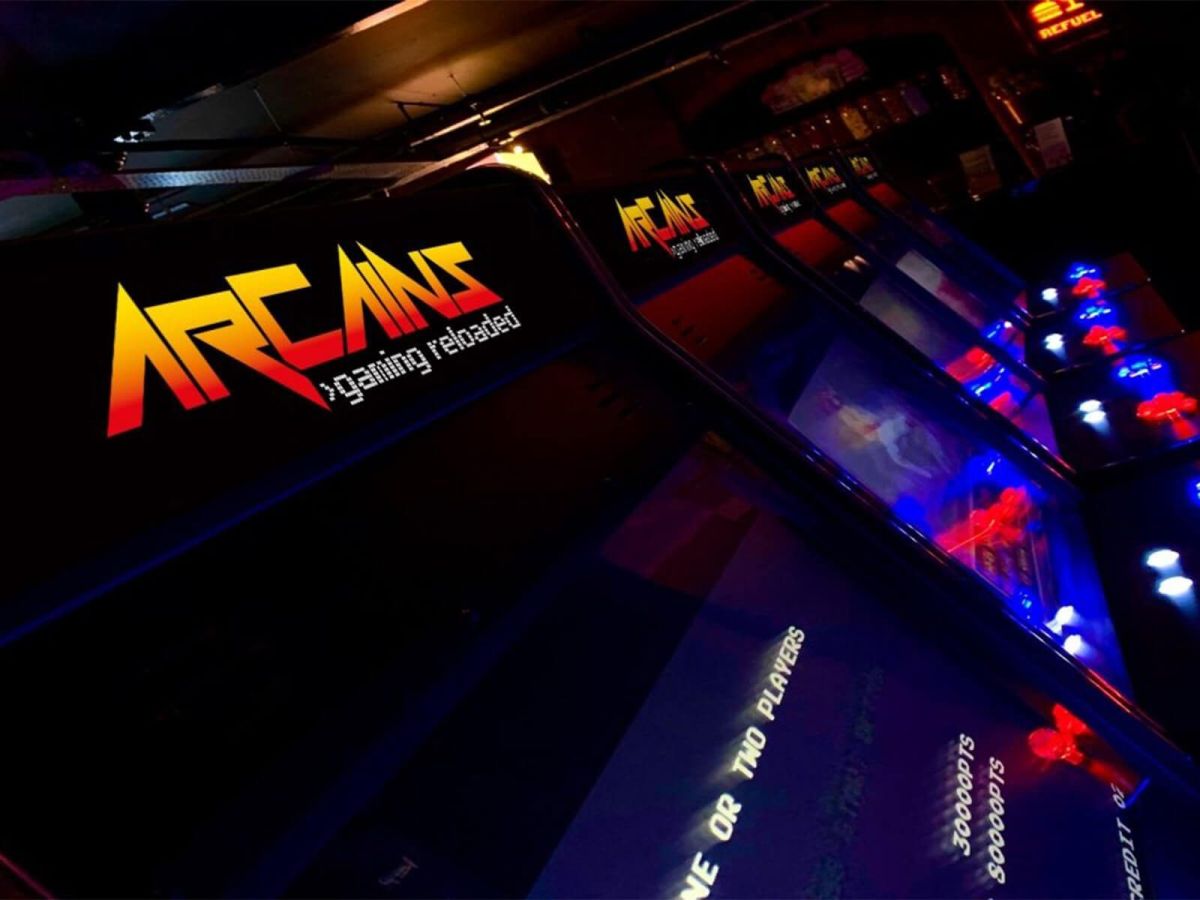
The team at ArCains identified and confirmed the flagship games for the venue from the outset, which allowed us to research the relevant retro fonts, colour palettes and styles of finishes that extended to full neon signage and pixel art character design.
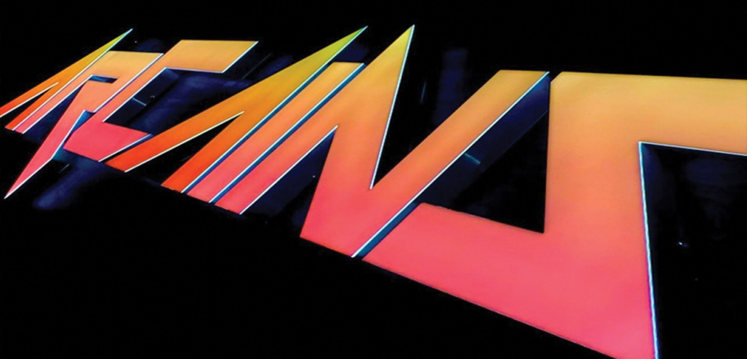
With the brief always in mind of creating a brand that ‘fits within the retro era’ but is a brand that will stand the test of time in today's fast-moving digital world, our team held a series of internal workshops. These workshops were done in stages, our initial stage was to research, suggest and create logo styles in flat black utilising retro font styles with a modern adaptation. After an internal rationale session around how the brand would work across the many platforms we narrowed down a shortlist of logo styles that we could take forward. Once this series of workshops was complete we then created a suggested ArCains colour palette taken from inspiration from our research of the retro gaming era. This process helped us identify a primary colour palette of six colours that were consistent across most of the flagship games we then narrowed this down to three colours as the stand out primary brand colours, red, yellow and black.
Cains Brewery Village has a very identifiable colour schema of red, yellow and black and is used consistently across the site. With this in mind we separated the colour palettes into two; primary and secondary. Primary being red, yellow and black which tied in nicely with the Cains Brewery brand and secondary being all other colours such as greens and blues which will be used to complement the brand moving forward.
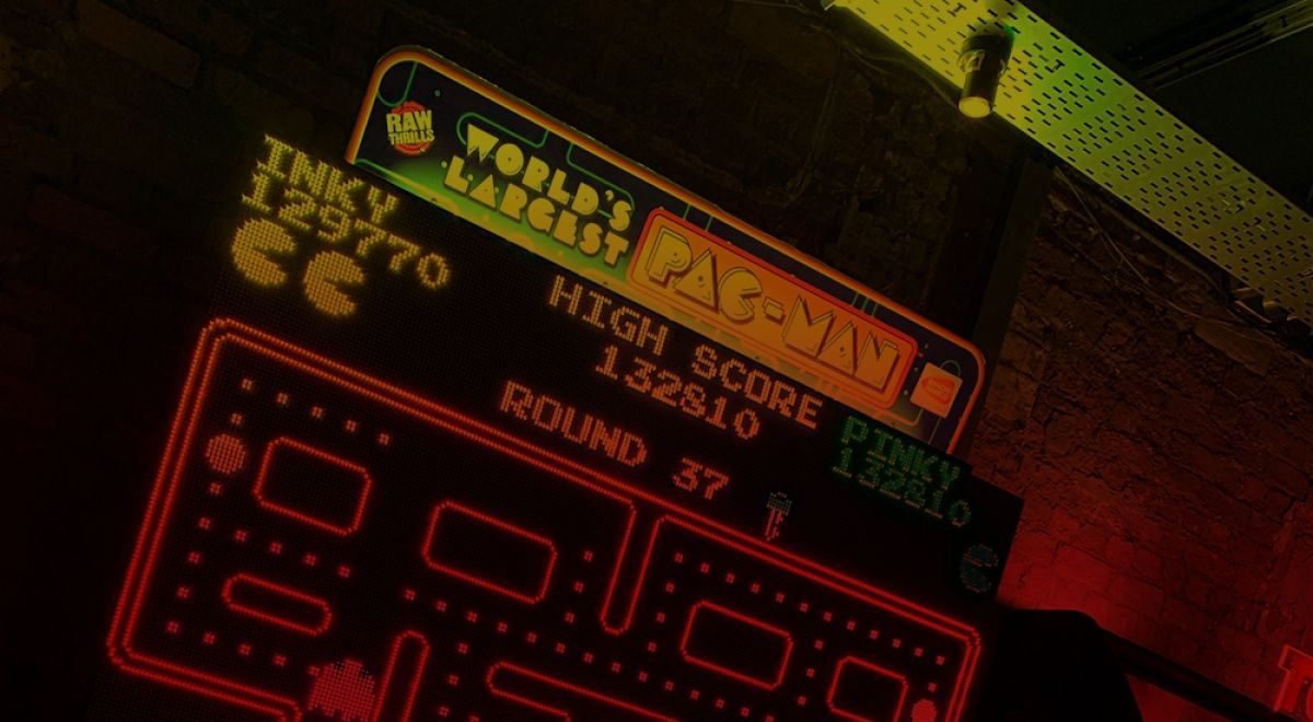
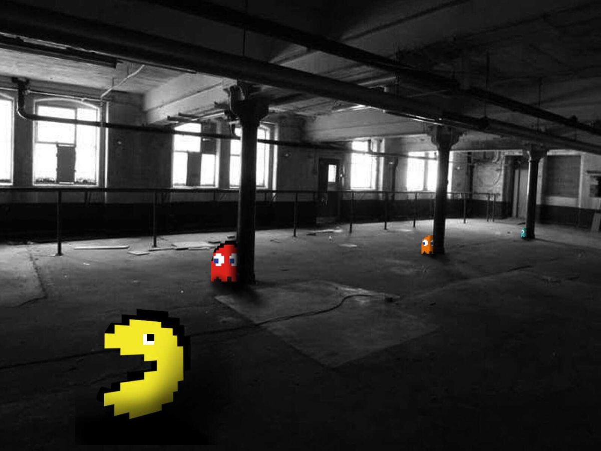
Within our final brand workshop before presenting our findings to the client, we experimented with the primary colour palette and the suggested font styles chosen in our initial workshops. This produced a series of brand styles from flat block colours to neon styles, gradients and logos that tipped their hat to retro game classics such as Pacman.
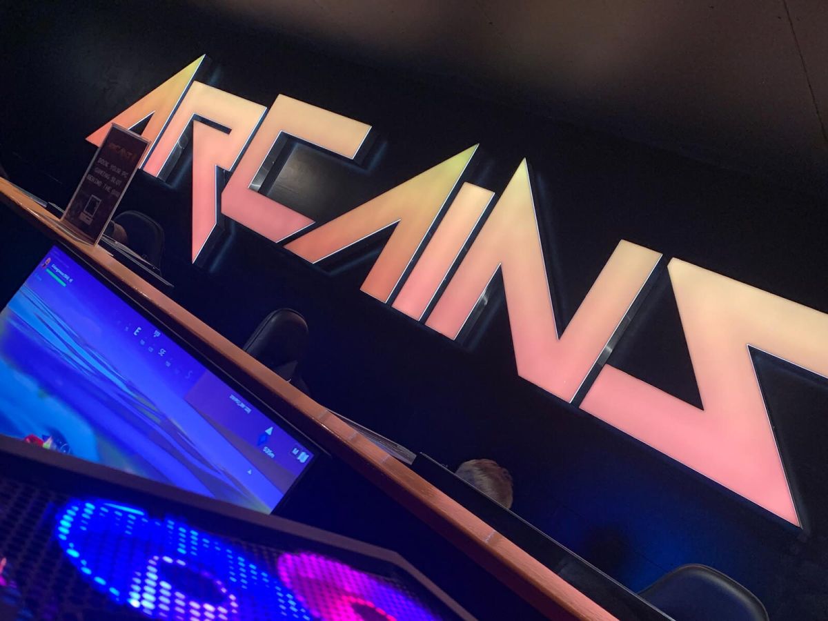
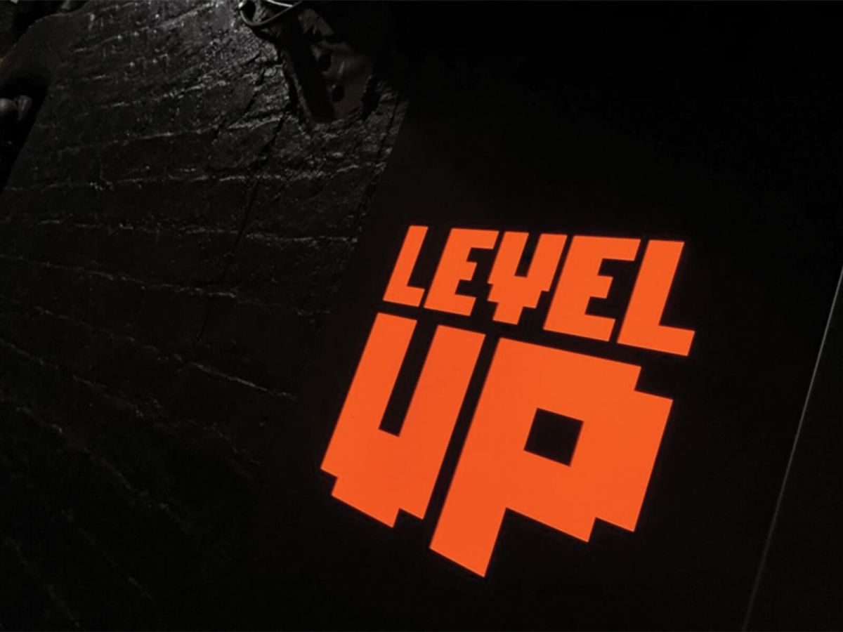
Our final brand solution was a blend of multiple games, retro fonts and treatments that subtly gives recognition to the recognisable gradient arcade-style whilst remaining contemporary and stand out in our modern world. We underpinned the logo with a strapline that defined the essence of why ArCains was created - ‘gaming reloaded’ again using a complementary typeface that works alongside the brand font.
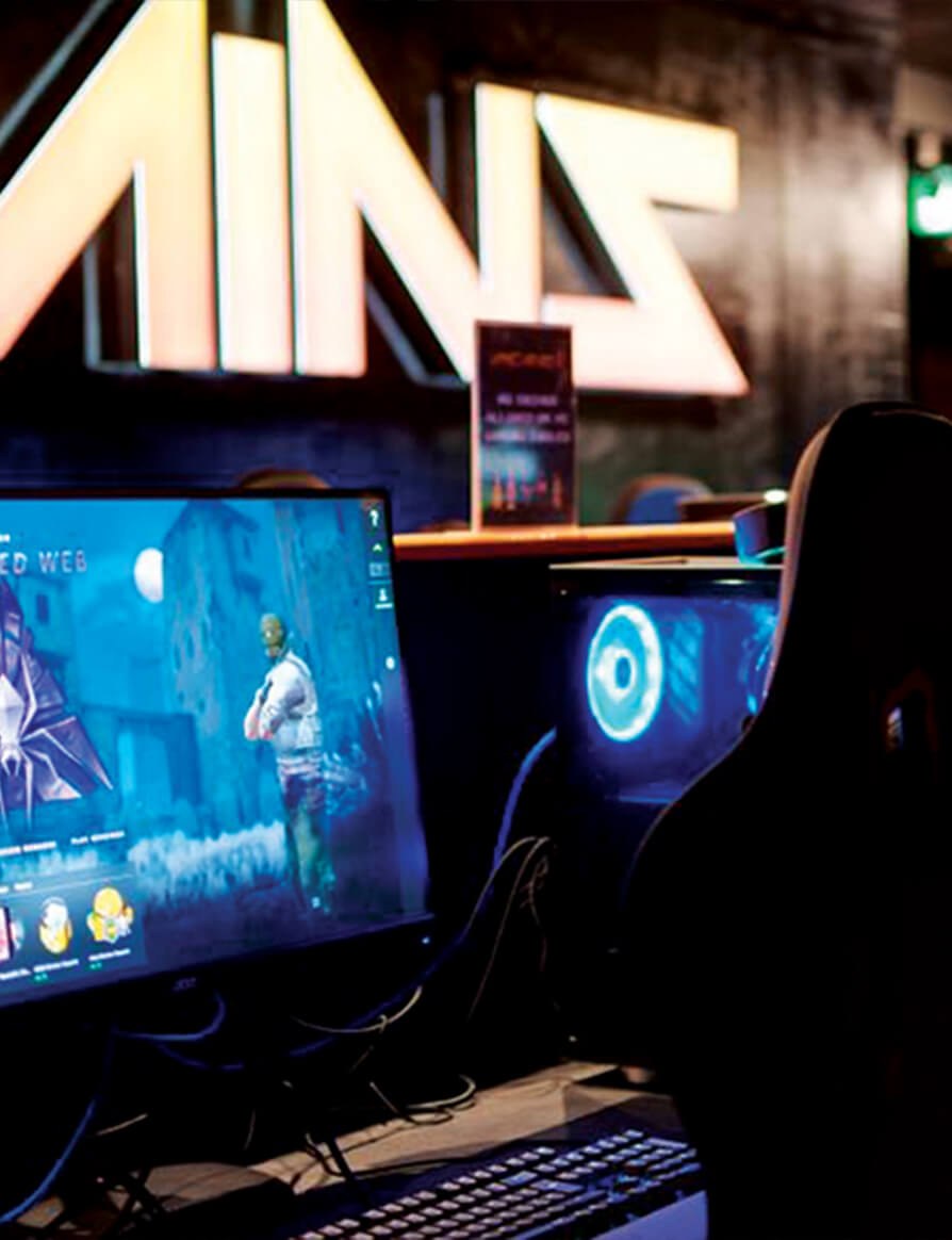
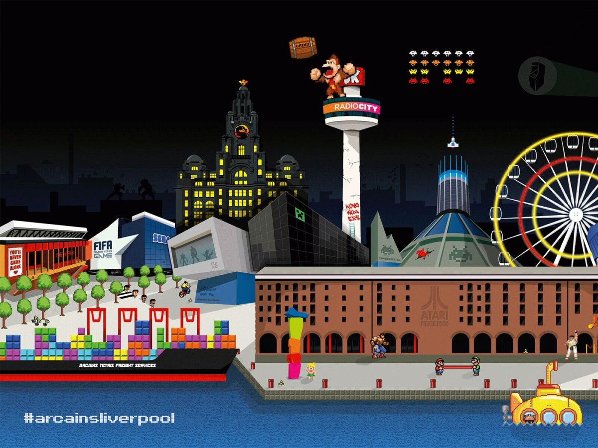
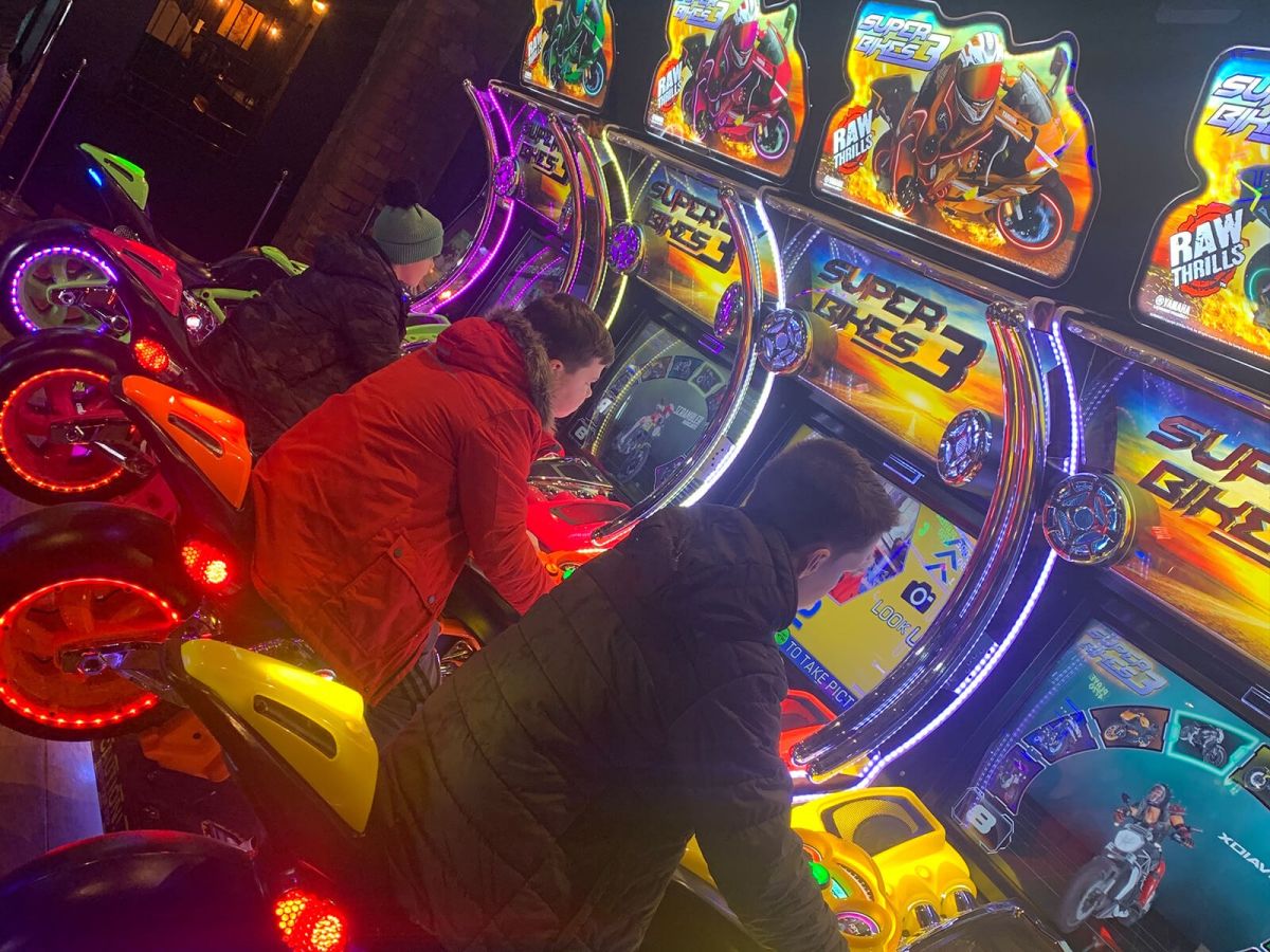
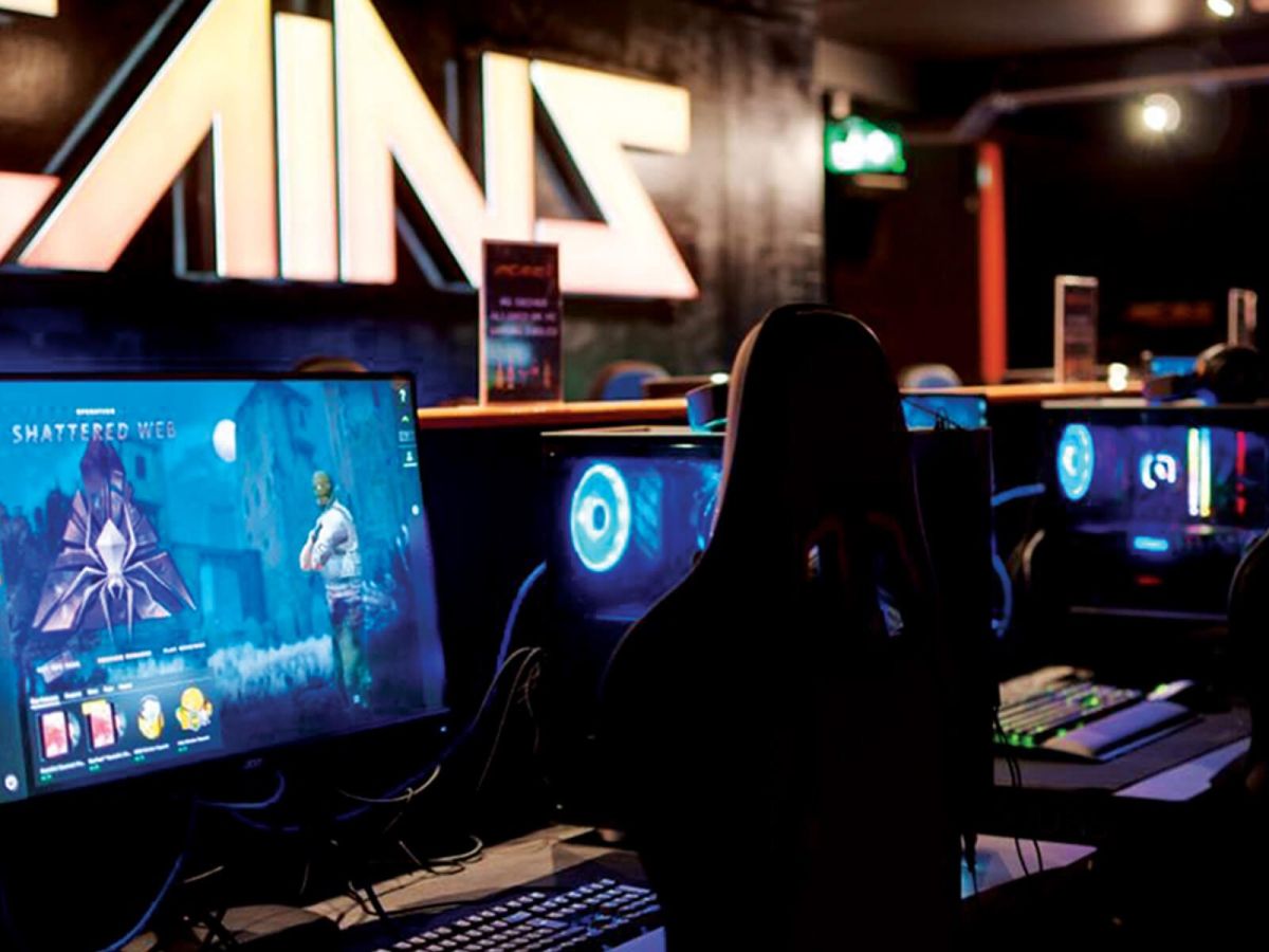
Having developed a brand that both ourselves and more importantly our client Mikhail Hotel & Leisure Group are proud of, has created a platform for a potentially scaleable brand and venue. The Liverpool complex has been a huge success and is gaining increasing footfall week on week. The brand has been rolled out across web, signage, interior design, apparel and merchandise which customers can purchase on-site. One of the key focus points of the interiors is a 5m x 3m Liverpool skyline which sevenseven had the pleasure of illustrating in a retro gaming style turning key iconic landmarks into buildings representing some of our favourite games. For example, the Echo Arena is now the Sonic Arena and the Albert Dock has become the ATARI Dock, check it out below, it still makes us smile :)
From a business perspective the underlying results speak for themselves - not only is the brand retro, fun and on point but it gives the business a true identity to move forward and expand upon.
Rob Ashcroft, Director